Monday, May 18, 2009
Sunday, May 17, 2009
Rita Masarin .Surf Brand
My surf brand would appeal to women from age 18+ . Aimed at surfers who appreciate how surfing use to be, the TRUE SPIRIT of the sport friendly, chilled and cruisie
Products will include a range of summer and winter clothes, the clothes and swimwear will be designed to cater for different shapes and sizes and not just to skinny models. The material used will need to be made from organic cotton and printed using soy based inks. The wetsuits made from recycled fishing nets and polyester products. Other products will include surf and travel accessories
South Pacific, Tiki and Australian beach culture of the 60’s will be the main influence of my design.
Fun, active, retro, kitsch, practical, flexible, playful, and comfortable would describe the personality and concept of my surf wear.
The choice of names I came up with are;
Soul surfer,
Black
Blue
Flying Fish,
Sugar Shack,
Nalu (means; Surf, Wave, Ocean. in Hawaiian)
Soul Glider,
Sugar Curl,
Island Spray,
Surf Sistas
True Spirit
Sugar Kurve,
Island Reef
Cross Step
I ‘m liking Blue Pearl, blue for the colour of the ocean and pearl being the jewel of the sea but I haven’t decided on the colour of the logo yet. I’m tempted to NOT use the obvious aqua, Prussian blue, purple and white and go for something totally different…..so any suggestion is welcome.
Environmental and the conservation and protection of cetaceans and their environment are the issue of concern for me. As surfers it’s our karmic duty to protect the oceans inhabitants. I have always respected the ocean and all that live in it. The ocean and its contents is our greatest resource. This resource needs protection I hope that we're not too late.
My range will be distributed throughout
Wednesday, May 6, 2009
Brianna - SNOW - Branding


Gender - Female
Age - 15-30
Season – winter
Subculture - Young girly snowboarder/skier with attitude, but funk flare and style. The fashion contuses girl that still wants comfortable and hard wearing clothes for the every day use and snowboarding.
10 WORDS
Fluffy, cutie, sweet but tuff, Attitude, white, pink, snowflake, bunny, Rabbits, Polar bear, ski, clouds, powder.
NAME IDEAS
• Snow bunny
• SNOW Flake
• Snow bear
• PINK POLAR
• Ice queen
• ICE PRINCESS
• Pink Ice Princess – PIP
• SNOW ANGEL
• Snow wings
• WONS
• Lrig Wons
• ICE ANGEL
• Ice wings
• POWDER PRINCESS
• Snow white
• PINK SNOW
Geographic
U.S.A Canada, Europe, Australia, New Zealand, U.K.
Would be sold in snow shops in cold climates, also to surf and skate shops for winter and autumn ranges.
Online shopping and wholesale to retailers.
Ski resort shops, Chain stores for surf skate and snow.
I Thought of SNOW BUNNY as a brand, but after researching on the net I discovered the there was already a company for girls snow gear called SNOW BUNNY.
Her are some of their logs.


Similar product and styles


First ruff ideas

snowboard brand by jules
Vision;
Colours: black, red, purple, silver, pink, lime green and white
i am endeavouring to create a snowboard label that is modern and elegant, appealing to gothic sensibilities and the imagination.To use design that is attractive to all ages because of its high quality and enduring style.
i would like to use the lastest space age fabrics in combination with natural and traditional fibres...that is, wools and silks, with a special focus on the development of hemp products which are environmentally sustainable.
so far my influences for this idea are marilyn manson, alexander mcqueen, jay mccarrol and john galliano.
Joana Surf Brand

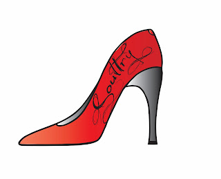
Soultry represents women in a sexy but respectful way,focusing on women between the age 20 and over...or anyone with a sense of style.
I feel women have a limited market and most of the products produced are repeatedly grungy graphics that may not appeal to the typical woman. My designs will represent a womens everyday lifestyle and bring those graphics into the snow environment. Producing products and graphics for the Autumn/winter range, designing boards and accessories, e.g. snowboards/vests/jackets/scarves/beanies etc.
Subcultural influences include the fashion/beauty industry e.g. bags, shoes, make-up.I woman can never have enough shoes.....even for the snow! I am also focusing on the heart, its shape and meaning for the logo design, with flowy font.
I decided to spell Sultry.....S O U L T R Y as it portrays a personal inner- beauty feel, being her soul. Autuum trees are beautiful, especially in the snow with its soft browns, yellows and greens which i will be also focussing on in my designs.
The personality and concept i would like to portray in my designs represents a real womens presense and witty sense of humour.
Colour swatches will include reds, blacks, pinks, pastels, browns and creams.
The range would mostly be available in the colder climates e.g jindabyne, nation wide specialty stores and internet orders world wide.
The main source of promotion for my brand will be sponsorship(from fashion industries/womens rights)/write ups, adverts in surf/snow local magazines/exterior/interior poster signage and snowboarding competitions and events.
My designs have a pop art/Paul frank influence with inspiring themes of the fashion industry/candy/characters/patterns/shapes and realistic imagery.
Some possible names included- tragic, bruisedbum, pino, webby, webb, penguin, lost, amused, clae, damand, focus, fine, reality, Style, denile, release, opinion, angels, faulty, obvious, maniquin.